
1.6 Describing the Distribution of a Quantitative Variable: Shape, Center, and Spread
- StatisticaHub

- Dec 9, 2024
- 4 min read
AP Statistics: Exploring one variable data
Once we have organized quantitative data into a visual display—whether a histogram, stemplot, or dot plot—the next step is to describe the data. This involves identifying patterns, trends, and key characteristics. A comprehensive description focuses on three critical aspects: shape, center, and spread. These components help in understanding the underlying structure and variability of the data. Let’s explore each in detail.
Shape of the Distribution
The shape of a dataset gives insights into its overall structure and layout. Key elements to observe include:
Symmetry
A dataset is symmetric if, when folded at the center, both sides are roughly mirror images of each other.
Symmetry often suggests that the data values are evenly distributed around the central value, such as in a bell-shaped curve or normal distribution.
Example: Heights of individuals in a population often follow a symmetric distribution.
How to Identify Symmetry
Visual inspection of a histogram or frequency polygon can help detect symmetry.
If the mean and median are nearly equal, this indicates potential symmetry.
Skewness
If one tail of the distribution is longer than the other, the data is skewed.
Right-skewed (positively skewed): The longer tail is on the right; the majority of the data is clustered on the left.
Left-skewed (negatively skewed): The longer tail is on the left; the majority of the data is clustered on the right.
Skewness provides information about outliers and the direction of the data's spread.
Example
Income distributions are often right-skewed, as most people earn a moderate amount while a few earn exceptionally high incomes.

Shape Visuals
Peaks (Modes)
Modes are the most frequently occurring values in a dataset and are represented as peaks in a histogram or dot plot.
Unimodal: One peak (common in symmetric distributions).
Bimodal: Two peaks (may indicate two subgroups within the data).
Multimodal: More than two peaks.
A uniform distribution has no clear peaks, as all values occur with similar frequency.
Importance of Modes
Identifying modes can reveal subpopulations or patterns within the dataset. For example, test scores of students in two different classes might result in a bimodal distribution.

Symmetric Distributions with different modes
Outliers
Outliers are extreme values that deviate significantly from the rest of the dataset.
These values can skew the data and heavily influence measures like the mean and standard deviation.
Identifying outliers is crucial for:
Understanding unusual data points.
Deciding whether they are genuine or errors in measurement.
How to Spot Outliers
Use boxplots to visually detect values outside the whiskers.
Use statistical methods such as z-scores or interquartile range (IQR) to identify potential outliers.

Boxplot Depicting Outliers Gaps
Gaps in the data may suggest multiple modes or distinct groups within the dataset.
For example, exam scores with a gap might indicate a divide between high-performing and low-performing students.

Data with Gaps
Center of the Distribution
The center represents the "typical" value of a dataset. Common measures of central tendency include:
Mean (Average)
Calculated by summing all values and dividing by the number of observations.
Sensitive to outliers and works best for symmetric distributions.
Example: The mean age of participants in a survey.
Median
The middle value when data is ordered from least to greatest.
Resistant to outliers and ideal for skewed distributions.
Example: The median income of a population provides a better sense of central tendency when income distribution is skewed.
Mode
The most frequently occurring value(s).
Useful for identifying popular or common categories in the data.
Example: The mode in a survey of favorite colors among children.
Comparing Mean, Median, and Mode
In a symmetric distribution, these measures are often close to or equal.
In a skewed distribution, the mean is pulled in the direction of the skew, while the median remains resistant.

Central Tendency measures
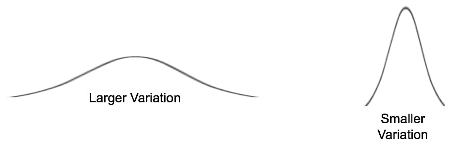
Spread of the Distribution
The spread describes the variability or dispersion of the data. Measures of spread include:
Range
The difference between the maximum and minimum values.
Provides a quick sense of variability but is sensitive to outliers.
Standard Deviation
Measures the average deviation of values from the mean.
Works best for symmetric distributions and is influenced by outliers.
Interquartile Range (IQR)
The range between the first quartile (Q1) and the third quartile (Q3).
Represents the middle 50% of the data and is resistant to outliers.
When to Use
Report mean and standard deviation for symmetric distributions.
Report median and IQR for skewed distributions or datasets with outliers.
Key Takeaways
When describing a dataset:
Shape reveals the overall pattern and structure of the data (symmetry, skewness, peaks, gaps).
Center indicates the typical value (mean, median, mode).
Spread measures the variability or dispersion (range, standard deviation, IQR).
By combining these elements, you can provide a detailed and meaningful description of any quantitative dataset, enabling better analysis and interpretation.
Key Vocabulary
Shape: Symmetric, skewed, multimodal, gaps.
Center: Mean, median, mode.
Spread: Range, standard deviation, IQR.
Outliers: Extreme values that deviate significantly from the dataset.
This detailed framework allows researchers, educators, and professionals to effectively describe and interpret quantitative data distributions. Let us know your thoughts or share examples of distributions you’ve worked with!


Kommentare