
1.8 Visualizing Summary Statistics: Five-Number Summaries and Box Plots
- StatisticaHub

- Dec 9, 2024
- 3 min read
AP Statistics: Exploring one variable data
In data analysis, graphical representations provide valuable insights into datasets. From simple measures of central tendency to advanced visualizations, these tools help us uncover patterns, detect outliers, and understand distributions. Among these, the five-number summary and its graphical counterpart, the box plot, stand out as essential techniques. Let's dive into how they work, their significance, and practical applications.
Understanding the Five-Number Summary
The five-number summary provides a concise overview of a dataset’s distribution, capturing its key features. It consists of:
Minimum value: The smallest data point.
First quartile (Q1): The 25th percentile, below which 25% of data lies.
Median (Q2): The midpoint, splitting the dataset into two equal halves.
Third quartile (Q3): The 75th percentile, above which 25% of data lies.
Maximum value: The largest data point.
Example 1:Dataset: {5,7,8,9,10,12,15,20,25,30}
Minimum: 55
Q1: 88
Median: 1212
Q3: 2020
Maximum: 3030
The five-number summary for this dataset is:(5,8,12,20,30)
This summary reveals the dataset's range, central tendency, and spread without overwhelming detail.
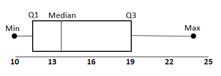
Box Plots: Graphical Representation
A box plot, or box-and-whisker plot, visualizes the five-number summary, providing an intuitive way to assess a dataset's distribution, detect outliers, and evaluate skewness.
The box spans Q1 to Q3, representing the interquartile range (IQR), which contains the middle 50% of the data.
The line inside the box marks the median (Q2).
The whiskers extend from Q1 to the minimum and Q3 to the maximum, stopping at the dataset's range or fences.
Outliers, if any, are plotted as individual points outside the whiskers.
Interpreting Skewness with Box Plots
Symmetric Distribution: If the median is centered within the box and whiskers are of equal length, the data is symmetric.
Right-Skewed Distribution: A longer whisker on the right and a median closer to Q1 indicate skewness toward higher values.
Left-Skewed Distribution: A longer whisker on the left and a median closer to Q3 indicate skewness toward lower values.
Example 2:Dataset: {75,80,85,85,90,90,90,95,95,95,95,95,95,100,100}
Five-number summary: (75,90,95,100,100)(75, 90, 95, 100, 100)
Median 9595 leans toward the lower quartile Q1Q1, suggesting a right-skewed distribution.
Outlier Detection with the IQR Rule
Outliers are determined using fences, calculated as:
Upper Fence = Q3+1.5×IQR
Lower Fence = Q1−1.5×IQR
Any data point beyond these fences is considered an outlier.

Example 3:Five-number summary for heights of 100 adults:(150,160,170,180,200)
IQR = 180−160=20
Upper Fence = 180+1.5×20=210
Lower Fence = 160−1.5×20=130
A height of 220 cm lies beyond the upper fence, making it an outlier.
Applications in Real-World Scenarios
Education: Teachers can analyze exam scores to identify outliers and understand student performance distribution.
Dataset: {75,80,85,…,100}
Box plot: Highlights the concentration of high scores, with a long tail for lower scores.
Healthcare: Researchers studying patient data (e.g., blood pressure or height) can detect anomalies and assess trends.
Heights of adults: Outliers might indicate measurement errors or unique cases.
Finance: Financial analysts can assess stock performance distributions to identify outliers, signaling risks or opportunities.
Key Takeaways
The five-number summary is a simple yet powerful tool for summarizing data.
Box plots offer a visual representation, making it easier to identify skewness and outliers.
Applying these techniques helps uncover patterns that raw numbers often hide.
By mastering these methods, professionals across industries can make data-driven decisions with clarity and precision. Ready to transform your datasets into insights? Start plotting today!


Comentários